Industry
Restaurant + Lifestyle
Date
2023
Sweetgreen Website UX Optimization

Overview
Sweetgreen approached me to perform a full UX and SEO audit of their website.
In the UX audit, I assessed the site’s performance in terms of usability and user experience. I provided a detailed report with bugs, user pain points, optimization opportunities. With the support of user data and recordings collected from Crazyegg, I was able to pinpoint less-than-perfect areas and shared which parts of the site are causing headaches for users and hindering conversions.
The SEO report provided an overview of how Sweetgreen stood compared to competitors, keyword opportunities, and page redesigns for the locations page – a high potential traffic target page.
Here I’ve shared some key UX and SEO optimization suggestions.
Optimization opportunities for poor UX pages
Menu
Findings
Highest traffic page (18% of all site traffic)
Most customers are entering the website from this page, but less than half are starting an order
75% of sessions are coming from Google with a 62% bounce rate
UX Problems
High rate of rage and dead clicks
Desktop content above the fold is not engaging
Users are unable start an order from the products shown on this page
Suggestions
To improve bounce rates and conversion rates, add links to product images and names so users can start an order
To provide a better experience and reduce scrolling, remove the large featured salad so images of products are visible above the fold
Reduce extremely long page length by organizing products into 4 columns on desktop and removing nutritional information since this information is on the detail page
Location Menu
UX Problems
Customers need to scroll past the fold to see products they can order
On desktop, there’s no intuitive way to change locations
“Collections” section takes customers to a new page that has a different UI than the location menu page, an unexpected experience
Customers are not using the filter feature
Suggestions
Reduce the height of the location details and remove the “Collections” section so products are visible without scrolling
Rename the navigation button “Menu:{Location}” to “Location:{Location}” and add the map icon that appears on mobile – this change also matches the terminology already used in the URL slug
Update link to go to location map page
Remove the hyperlink from “Ordering from {Location}”
Move the filter feature to the menu content area
Adjust the “Collections” section to behave as a filter
Product Customization
UX Problems
Intent of pencil icon is confusing
Customization process is awkward
Suggestions
Remove pencil icon - from user recordings I saw customers click on the icon to customize the product, but that is not the purpose of the icon
Use a different UI for added ingredients in the left panel
Locations
Findings
High bounce rates and dead/rage click data show signs that customers aren’t seeing the content they expect
98% of customers are coming from Google search
Google SERP result can be improved
UX Problems
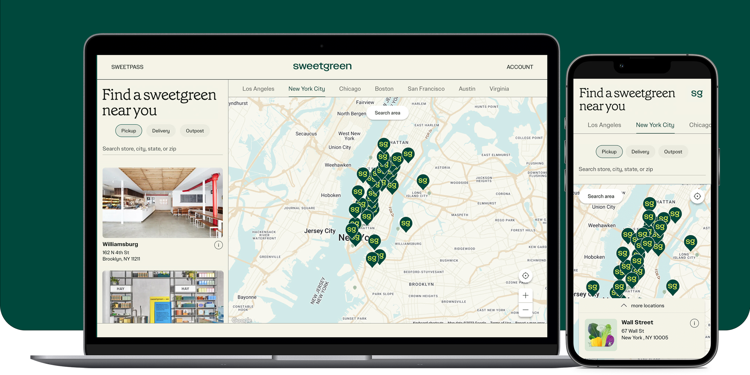
Current page doesn’t provide customers an easy way to find a location near them
The field on the page is location request form, not a search field
List of locations is not user friendly and provides no SEO benefits
Most customers are clicking on the “Locations” main navigation link though they are on the locations page
Illustration has high rate of dead clicks – it isn’t linked
Suggestions
Remove the illustration and replace with the locations map used in the order subdomain
Update the page layout so the page title and list of locations appears on the left - since the eye is trained to read left to right and top down
Add links to key cities and metro areas to improve map search functionality and to target Google SERP description
SEO Opportunities
Sweetgreen has the opportunity to increase monthly organic traffic by 6% (~37k sessions) by targeting the keywords “salad near me” and “salads near me” on their homepage.
It will be difficult to compete with high authority domains such as Yelp (100), Tripadvisor (100), and the delivery apps (80+), but it is possible to overtake ranking of direct restaurant competitors.
Other suggestions
Sweetgreen locations sometimes appear in Google’s “Local pack” but to increase visibility add structured data so the site can appear in rich results
Improve SERP descriptions sitewide to increase click through rates and provide better user expectations
Rework the /locations page to provide better SERP content